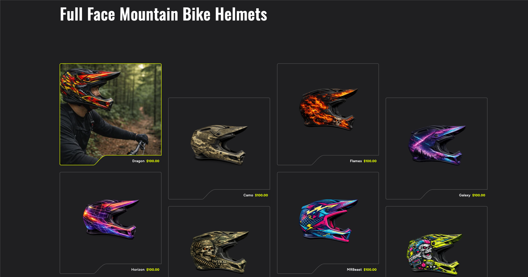
A custom collection section built on a Dawn development store, recreating a reference design at production quality: notched product cards, staggered columns, and a lifestyle image revealed on hover. One section file and one stylesheet. No JavaScript, no apps, no changes to the base theme.
The brief: a collection page for a line of full-face mountain bike helmets that feels like a product launch rather than a standard catalog. The reference design broke away from the usual Shopify grid with a few specific details:
The goal was to recreate that structure and interaction while still using the store's existing theme settings for color. The finished section needed to feel like part of the theme, not a copy of the reference.
| Approach | Why it won or lost | Verdict |
|---|---|---|
| Standalone custom section | Full control over the card shape, image treatment, stagger, and hover interaction without touching shared theme components. Filtering, sorting, and quick-add scoped out of version one, decided before development rather than discovered halfway through. | Built |
| Modify Dawn's collection grid | Dawn's product card is a shared component used throughout the theme. Changing its structure for one page risks regressions everywhere else it appears, and the staggered layout works against Dawn's grid system rather than with it. | Rejected |
| Use an app | No existing app produces a notched, staggered layout, so the section would still be built almost entirely by hand while adding a monthly subscription and a third-party dependency. | Rejected |
Each card needed a rounded border with a concave notch removed from the bottom-right corner, with the product title and price sitting inside that open area. The outline is an SVG path with a non-scaling stroke, and the SVG viewBox uses the same proportions as the card itself. That matters: stretching a square viewBox across a portrait card distorts the corner radii and changes the shape of the notch. Matching the proportions keeps the border consistent across card sizes.
The lifestyle image needed to fill the card on hover, but filling the entire rectangle also placed the image behind the title and price. A second clip path applied to a wrapper around both product images follows the shape of the card and stops before the notch. The outline, title, and price stay outside the clipped area, so product information sits on a clean background no matter which image is visible.
The studio shot uses object-fit: contain so the whole helmet stays visible against the theme background without cropping. The lifestyle shot uses object-fit: cover so it fills the card completely during the hover. Treating both the same cropped the studio products, which was one of the first issues caught in visual QA.
The lifestyle image is revealed by an elliptical clip-path anchored to the top of the card: it appears in the center first and spreads toward the corners. The hard part was the final size of the ellipse. Large enough to reach the bottom center can still leave the bottom corners uncovered; too large and the card is fully covered before the transition finishes, so the remaining animation time appears to stall. The section uses the smallest ellipse that still reaches both bottom corners as the final state, which lets the reveal use the full transition duration and finish exactly when the card is covered. The start and end shapes live in CSS custom properties and are reused for both hover and keyboard focus, keeping the two interactions consistent.
Alternating columns are offset vertically with a transform, and transforms only move an element visually: they reserve no space in the document layout. Without accounting for that, the lowered cards extended past the section and were covered by the background of the section below. Instead of a fixed amount of bottom spacing, the offset is defined once as a custom property and used for both the transform and the section clearance, so the visual offset and the space reserved for it stay in sync across breakpoints.
The section behaves like a native part of the theme. It reuses Dawn's page-width container, section spacing pattern, mobile spacing multiplier, color scheme classes, RGB color variables, and pagination component. Colors are not hard-coded: the merchant selects one of the theme's existing color schemes and the section inherits the appropriate background and text colors. The darker visual treatment comes from picking a dark scheme, not from a separate set of custom values. When no accent color is chosen, the section falls back to the theme's link color so it looks correct immediately after being added.
Merchant controls were scoped deliberately. The merchant can change the heading, products per page, color scheme, accent color, and section spacing. The merchant cannot change column counts, card proportions, notch geometry, stagger distance, or transition timing. Those values define the design itself; exposing them would make it easy for the layout to break across screen sizes.
Editor-facing labels use literal strings rather than new translation keys, since new keys would mean updating every Dawn locale file with English placeholder content. All customer-facing text remains translatable.
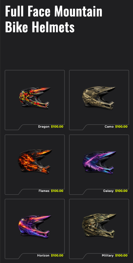
The work ran in four stages: scoping, planning, development, and structured QA. Scoping answered the questions that cause problems later: where the accent color comes from, what belongs inside the notch, how the layout behaves at tablet widths, what happens when a product has no second image, and which features were out of scope for version one. The QA checklist was written before development began, and a large part of visual QA was done by rendering the component headlessly and inspecting the output before deployment.
Issues caught and corrected against the reference across seven rounds:
Four staggered columns on desktop, two on smaller screens, custom notched cards, and a smooth lifestyle reveal. The entire feature is two new files and a template reference: isolated, removable, and structured so the next developer can understand it without digging through modifications across the rest of the theme.
Liquid · CSS · SVG paths · clip-path · CSS Grid · Custom properties · Dawn 15.4.1 · Shopify CLI · Theme Check